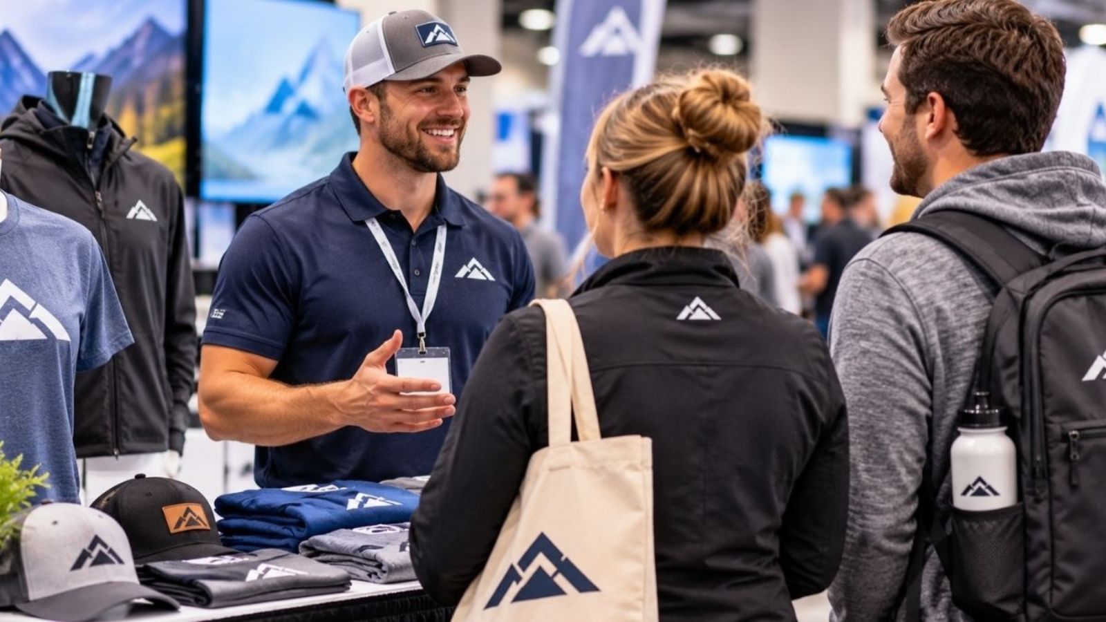
At a trade show, employees move between booths, greet visitors, and demonstrate products. A logo that looks clear on a design proof may be harder to recognize in a crowded exhibition hall.
Effective logo placement on apparel considers viewing distance, garment style, and how attendees encounter employees. The right placement helps people recognize a company without making the design look cluttered.
5 Logo Placement Strategies for Trade Show Apparel
Each placement serves a different purpose. Consider how employees will interact with attendees before choosing where the logo should appear.
1. Left Chest for Close-Range Recognition
The left chest is a familiar location for company logos. It works well when employees speak with visitors at a booth or answer questions face-to-face.
Consider these guidelines:
- Keep the logo simple: Prioritize a recognizable symbol or company name.
- Check the dimensions: Make sure lettering remains legible at the intended print size.
- Account for garment style: Necklines and shirt cuts affect how the logo sits.
A left-chest logo creates an understated appearance but may be difficult to recognize across an exhibition hall. Teams that move around the venue may benefit from an additional placement.
2. Back Print for Visibility Across the Aisle
Attendees may see employees from behind as they walk between booths. A larger back print gives the brand more room to stand out.
Consider these approaches:
- Company name: Make the business name the primary visual element.
- Short slogan: Use a brief message that communicates the company’s purpose.
- Website address: Include a short URL when it supports the event’s marketing goals.
Avoid filling the back with multiple slogans, contact details, and graphics. Keep important text away from seams and the bottom hem, where fabric movement can affect its appearance.
3. Sleeve Branding for Secondary Identification
Sleeve printing adds another branding opportunity when the chest or back carries the main design.
Possible sleeve elements include:
- A simplified company logo
- An event name or year
- A small campaign graphic
- A short brand message
Sleeves move as people walk and gesture. Keep the artwork simple, and check that it does not wrap too far around the arm or become difficult to see.
Sleeve branding works best as a supporting detail rather than the only place where the company name appears.
4. Match Placement to the Garment and Its Fit
A design that looks balanced on one shirt may not work as well on another. Necklines, seams, fabric stretch, and garment proportions can change how printed artwork appears.
Before approving a design, check these details:
- Shirt style: Confirm that placement suits the selected cut and neckline.
- Size range: Review how the logo looks on smaller and larger garments.
- Print dimensions: Make sure the artwork does not appear cramped or oversized.
- Fabric behavior: Consider how folds and stretching affect the design.
For group orders, review representative garment sizes rather than relying on a single mockup. Ask whether a physical sample is available if precise placement or color matching is important.
5. Coordinate Multiple Placements Without Cluttering the Design
Using several logo locations does not automatically improve visibility. Repeating a large graphic on the chest, back, and sleeves can make the shirt look crowded.
Instead, assign each placement a specific role.
|
Placement |
Best Use |
Detail to Check |
|---|---|---|
| Left chest | Face-to-face conversations | Logo is recognizable at close range |
| Back | Visibility from farther away | Main message is easy to identify |
| Sleeve | Secondary identification | Artwork remains visible during movement |
| Front center | Prominent event graphics | Design balances with the neckline |
| Upper back | Subtle team identification | Artwork does not crowd the collar |
A small booth team may need only a chest logo, while employees moving around a large exhibition hall may benefit from front-and-back branding.
Choose placements based on how the team will use the shirts, not simply on how many printable areas are available.
Shirt Colors and Logo Visibility
Garment color affects how easily attendees can distinguish a logo. A design that stands out on a white shirt may lose contrast on a dark garment.
Consider these combinations:
|
Shirt Color |
Design Approach |
Detail to Check |
|---|---|---|
| Black or navy | Use a white or bright logo | Fine details remain visible |
| White or cream | Use a dark or multicolored logo | Pale elements have enough contrast |
| Red or green | Use contrasting brand colors | Logo does not blend into the fabric |
| Gray | Use bold lettering or graphics | Main elements remain distinct |
Check the logo against the selected garment color before finalizing the artwork. Small text, thin lines, and similar shades can become difficult to distinguish when printed.
Planning a Trade Show Apparel Order
Finalize placement alongside garment selection, quantities, and production schedules. Changes after production begins may lead to additional costs or delays.
Use this checklist to organize the order:
- Confirm the event date: Establish when the shirts must be ready.
- Choose the garments: Check available styles, colors, and sizes.
- Finalize the artwork: Approve logo dimensions, placement, and colors.
- Collect sizes: Consolidate employee selections before submitting quantities.
- Confirm the schedule: Ask about turnaround times, delivery, and applicable charges.
Assign one person to collect sizes and consolidate feedback. This helps prevent conflicting instructions and inconsistent artwork approvals.
Contact Omaha Shirts to confirm available custom apparel options, artwork requirements, pricing, and production timelines.
Choosing the Right Logo Placement
The most effective logo placement on apparel depends on how attendees encounter the team, the garment being printed, and the message the company wants to communicate. Chest logos support close-range recognition, back prints improve visibility at a distance, and sleeve graphics provide secondary branding.
Prioritize the most important viewing angle and add other placements only when they serve a clear purpose. Reviewing the artwork against the selected garment helps businesses create cohesive trade show apparel that represents their brand clearly.
Frequently Asked Questions
Should trade show shirts include employee names?
Names can make introductions easier, especially for teams handling demonstrations or customer inquiries. Keep them secondary to the company logo so attendees can identify the business first.
What artwork file should businesses provide?
Ask the printer which formats it accepts. Vector files are useful for resizing logos without losing sharpness, while high-resolution raster files may also work depending on the printing method.
Can a QR code be printed on a trade show shirt?
Yes, but the code needs sufficient size, contrast, and a relatively flat printing area. Test a printed sample with a phone before ordering.
How can businesses help printed logos last?
Follow the garment’s care instructions and ask the printer about any washing or drying precautions for the selected printing method. Proper care helps preserve the design’s appearance.
Should businesses order extra shirts?
A small reserve can accommodate late additions or replacement needs, but extra garments increase costs. Confirm the final headcount and the price of additional shirts before approving the order.
Omaha Shirts & Retro Shirtz | Custom Design Tees inside Westroads Mall in Omaha, NE
We print Custom Shirts in full photo color, have no setup fees, and don’t charge for additional colors. The price you see is the price you pay for your completed shirts. And don’t worry about the cheap T-shirt Printing and design. We carry the highest quality Gildan brand shirts available.
Stop by any day of the week or contact us for a great Omaha Custom Shirts & T-Shirts, Nebraska, sweatshirt, or hoodie! Adult unisex, youth, baby, and women’s apparel is available.